The stage at the Conservative Political Action Conference that bore the shape of a Nazi symbol, Amazon’s logo that was shelved because it resembled Hitler’s mustache: how the visual language of the Third Reich refuses to die
The CPAC conference, held early this month at a Hyatt hotel in Florida, brought together most of America’s right-wing movements. The goal was to lick the wounds caused by the loss of the elections and to demonstrate a strong united front. The main event was a speech by former President Donald Trump, who chose to take advantage of the platform to announce his intention to run again for leadership of the Republican party as its candidate for the 2024 presidential elections. The expectant and curious eyes and cameras of the world were drawn to the conference stage, and that is precisely where the problem started.
More than a few people suddenly realized that the conference stage was shaped like a Nazi symbol, the Odal Rune, an ancient European symbol that was later appropriated by the Nazis. Nazi Germany dealt extensively with the creation and development of a mythic past for the movement’s racial policy and the alleged supremacy of the Aryan race. In this context, they enlisted the runes, the runic alphabet being a writing system used in ancient times by the Germanic peoples of northern Europe before the adoption of the Latin alphabet. The Odal Rune is one of them, and among other things was featured on the flags and uniforms of the SS. Today it is used by neo-Nazi organizations seeking to play down their Nazism. And on this stage, Donald Trump stood and delivered his speech.
The conference organizers didn’t bat an eyelid when they came up with the good old, tried and true answer and claimed it was a coincidence, tacking on the assurance that some of their best friends are Jews. That may well be. In any event, the Hyatt chain expressed its opinion on the totally coincidental design of the stage, calling it “abhorrent”. Publicly, once again, a direct link was established between the Republican party and the most radical fringe of American society.
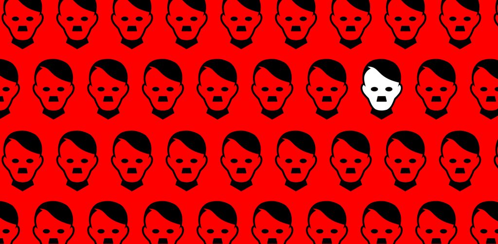
The conference was barely over before it was followed by another debacle when e-commerce giant Amazon redesigned its app logo, and then immediately shelved it and quietly replaced it with another. This time, the reason was far more innocent: the logo that was replaced resembled, in the eyes of very many, a smiling mouth topped by a little Hitler mustache (the designers’ intention had been to draw a box with adhesive tape).
Both these anecdotes can be viewed through a prism of political correctness. But that is only half of the story. Because it is also the story of the power of well-designed visual language. Hitler – besides being a monster – was also a genius when it came to branding. Branding himself. The bizarre mustache was so unforgettable that an innocent mistake by a designer who erred in the placement of his drawing of adhesive tape was enough for millions of people in 2021 to immediately identify the face of evil (the mustache branding job was also accompanied by a great story: one day during the First World War, Hitler’s unit was attacked with British mustard gas, forcing him to quickly clip both ends of his mustache so that his gas mask would fit over his mouth properly).
Like the mustache, the appropriation of ancient symbols, including the swastika and runes, worked well. Hitler, with the help of his assistant, the architect Albert Speer, developed an aesthetic that was both terrifying and attractive (the boots, the Hugo Boss uniforms, the massive public buildings) and continues to confuse us from its grave, eight decades after its defeat. The Reich was defeated. Its visual language continues to mess with our heads.